Sparrowhawk Wayfinding branding
New company identity
The goal
Create a professional identity for a new Wayfinding company
The logo identity for use on administrative paperwork, corporate stationery and promotional marketing
Service used: Gold branding package
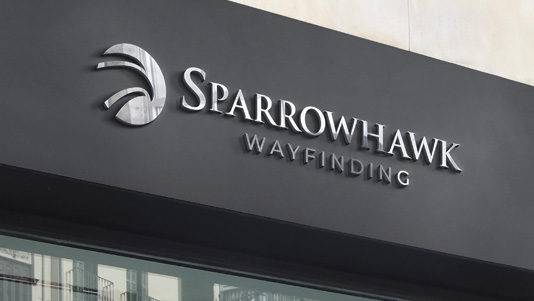
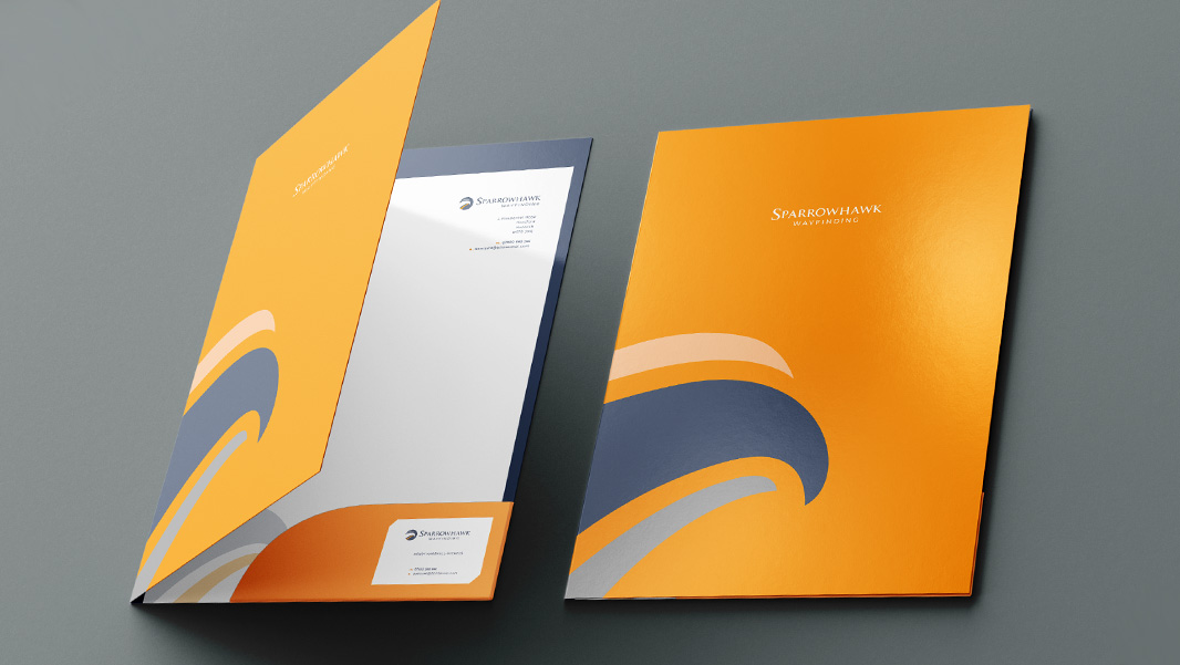
Kevin at Hoverfly produced a fresh and impressive identity for my new venture “Sparrowhawk Wayfinding. The process was a pleasure from the first contact to the final designs and excellent value.
HENRY MARSHALL-NICHOLS, Owner – Sparrowhawk Wayfinding
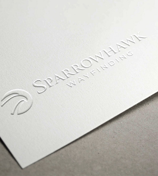
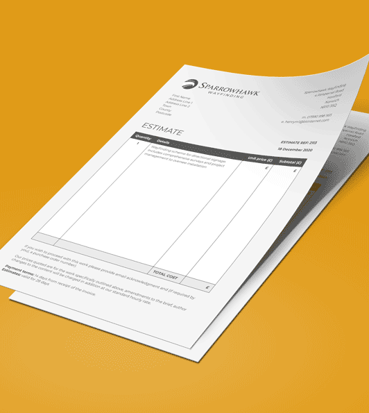
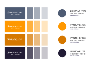
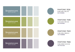
Extended colour palette logo options
Open brief
Sometimes clients come to us with a brief of ‘surprise me!’ They don’t have a specific vision of what their brand should look like and are wanting to see ideas. Sparrowhawk Wayfinding started out with no name, and a completely open brief. They need help in devising a name and taking them through the discovery session steered the process which led to the chosen name. Once we had the name the vision for the identity fell into place. The primary brand colour palette is taken from the sparrowhawk bird colours. We wanted to create a design that was slick and professional, looked highly established and was a great fit for our client who was starting a new business based on an area of expertise they had worked in for many years. Wayfinding is signage systems inside and outside buildings that give locational and directional information, literally helping people find their way.
Gold brand package
Once we had the logo design approved, we added a secondary brand palette and logo variations, as well as brand fonts. We also produced graphic design items from our gold brand package to provide bespoke design estimates and invoices, letterheads, compliment slips and business cards, as well as a folder design and artwork. As part of the visualisation process we showed signage options. We also provided a brand usage guide to maintain consistency and get this new business off to a flying start.

