Company brand design UK | Carrutaco Energy
New UK based energy company brand identity
The goal
Create a strong, established looking, company brand visual identity design, with the values of trust and quality of service
Carrutaco Energy is a new UK based trading company engaging with International customers to provide energy services
Service used: Premium company brand design
Help with brand naming, through to composite brand guide
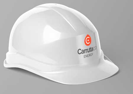
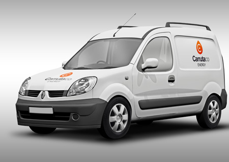
Carrutaco Energy is a new UK based company. At the start of the project the company didn’t have a name and Hoverfly Design assisted in the process to get to a final company name. Hoverfly then went on to create a series of logo options refining the preferred route to get to the completed logo shown. Hoverfly Design also developed the logo into a brand guide to include brand fonts, colours, logo usage, do’s and don’t and further provided examples of the logo in use within our Premium logo package price. The brand guide produced can be viewed here.
The chosen concept
Hoverfly Design produced a total of 6 different logo design routes as a first draft design presentation, with variants of each of the concept options. The chosen concept was further developed exploring different font and colour options to get to the final design. The droplet icon represents energy in liquid form as Carrutaco is mainly trading in petrochemical products. The ‘C’ in the centre represents Carrutaco and the addition of the second turned droplet turns the ‘C’ into ‘E’ for Energy. This multi-layered subliminal process creates a memorable and simple iconic identity, that appears established whilst working on other levels. The use of strong red and dark grey symbolises strength, power and energy which associates perfectly with the product.


